Regulators and primary data owners first, every release date checked by hand, and anything commercial, gated or paywalled labeled as such.
This page indexes 39 broadband data sources, grouped by subject and ordered for the people who
have to work with them. Each group opens with the question it answers, and each entry says what the source
publishes, how current it is, and where it stops being the right tool.
How we picked these
Authority. Primary data owners and regulators first: the FCC, NTIA, the Census Bureau, Ofcom,
the OECD, the ITU. Then established research organizations and associations. A source that
republishes someone else’s numbers is listed as a republisher, not as the source.
Currency. Every entry was opened and its latest release checked. Anything discontinued came out,
which is why 2 well-known measured-speed programs are missing: the FCC’s Measuring Broadband
America, whose thirteenth and final report landed in August 2024 on data collected in late 2022, and
Australia’s Measuring Broadband Australia, which closed after its 33rd report in June 2026. The ACCC
still collects performance data from providers under record-keeping rules; the FCC has no successor.
Presentation. Interactive tools and downloadable data rank above a PDF, and anything behind a
form or a paywall says so in its entry.
Two rules did most of the cutting. Vendor forecasts are out: a five-year projection from the company
selling the equipment is marketing, whatever the chart looks like. Commercial measurement stays where
the data is the product and the method is published, labeled commercial: Ookla, Opensignal,
Cloudflare, OpenVault.
Last checked September 24, 2026.
Broadband availability and mapping
Who has service, and where? The availability answers here nearly all trace back to the same provider-reported federal data, which is why they disagree at the edges.
freeFederal Communications Commission · live map, data download
The legal baseline. Location-level fixed and mobile availability reported by providers through the Broadband Data Collection, downloadable in bulk by state or provider and available as an API. Published every six months, at June 30 and December 31 vintages. Provider-reported throughout: what carriers say they can serve, not what is installed.
freeNational Telecommunications and Information Administration · dashboard, data download
Interactive maps, charts, tables and fact sheets on internet use and adoption, with the microdata in CSV, Stata and R. Built on the Internet Use Survey, a Current Population Survey supplement fielded every other November since 2017, with 15 waves reaching back to 1998. Sample code and weighting methodology are on GitHub.
freeNational Telecommunications and Information Administration · live map, data download
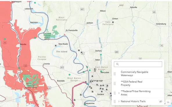
A route-planning map for federal grant recipients: which permits a broadband build needs. Layers span federal and tribal land, wetlands and flood hazard, rights of way and critical habitat. Coverage is uneven by state, with land data for all 50 but historic preservation offices for 10 and rights of way for 5. The whole stack downloads as an ArcGIS Pro package.
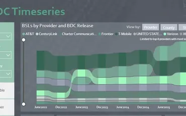
The company behind the Location Fabric that the FCC map and BEAD are built on. Its time series dashboard tracks how each provider's footprint moved across all eight BDC releases, June 2022 to December 2025, by technology and serviceable location count.
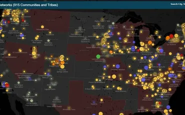
Maps 915 municipal and tribal community networks, filterable by business model, population and year established back to 1980, and overlaid with the states that have preemption barriers to public networks. Answers what no federal dataset does: who owns the network, not what speed it sells. ILSR advocates for public ownership, which shows in the writing more than the map.
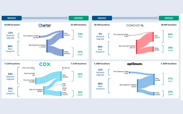
Biannual, built on each BDC release: top 25 fiber builders, top 25 ISPs by locations served, all 210 DMAs ranked by providers per location, and each large cable operator's footprint growth. Eight data tables are free; the Excel version needs a form. Residential fixed availability only, territories excluded, advertised speeds. Cartesian also runs the Fiber Broadband Association's annual fiber deployment cost survey.
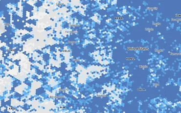
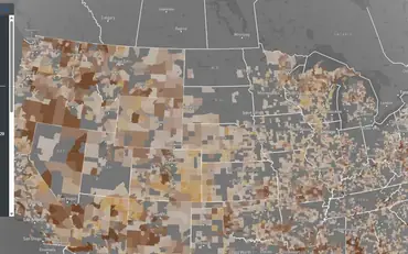
A free visualization of public US broadband data: unserved and underserved thresholds on sliders, county or hexagon resolution, and filters by technology. Built for local governments writing digital opportunity plans and operators sizing investment. Runs on FCC BDC data rather than its own collection. The same team publishes a Digital Opportunity Index scoring 14 publicly traded ISPs, twice yearly since 2025.
Where is the BEAD money going, and what changed this week? The assembled final-proposal data as raw files and as a dashboard, and the daily policy digest that tracks what moves around it.
freeAdvanced Communications Law and Policy Institute, New York Law School · data download
BEAD final proposal data assembled into one download: subgrantee, project, location, excluded-location and community anchor files as Parquet and zipped CSV, dated 27 August 2026. Compiled from draft, submitted and NTIA-approved proposals, and ACLP says plainly it is not authoritative.
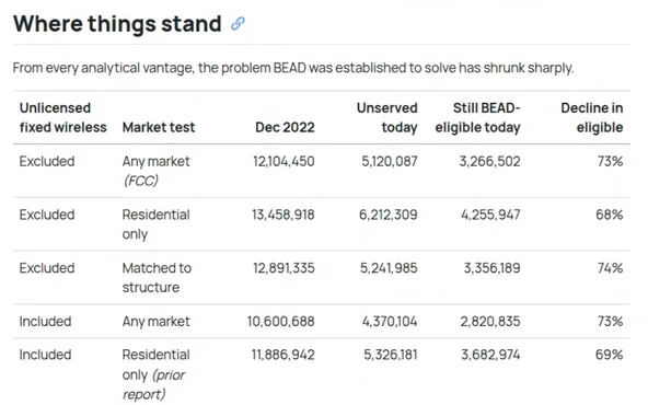
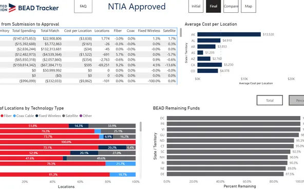
A national dashboard built from the final proposals states file with NTIA, with tabs setting the initial version against the approved one so you can see what curing changed. Cost per location, technology mix and remaining funds, all by state. No update date anywhere on it, and the totals move as NTIA works through curing.
A non-partisan daily digest of broadband policy news, free with no signup and approaching 8,000 issues. Every item names its source and labels the coverage type, so you can tell a press release from reporting before you click. Benton also publishes its own research on adoption, affordability and the ACP's expiration, free and without a form.
What is the business behind the network? Operator benchmarks, subscriber and revenue estimates, and the only recurring source here for how much data households actually use.
Quarterly fixed broadband subscriber counts by operator, country, region and technology, with historical series back to 2002 and more than 170,000 quarterly tariffs. The analysis and charts linked here are public. The searchable database behind them is a paid subscription.
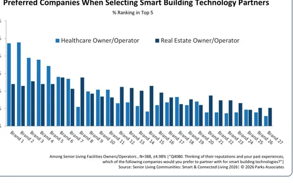
Consumer research on the connected home: smart home devices, security, streaming and senior-living technology. The press releases and analyst blog are free to read and the white papers require a form. The broadband data is not public: it sits in the Broadband Market Tracker, a paid membership carrying quarterly subscriber and ISP revenue estimates for 20+ US and Canadian market leaders.
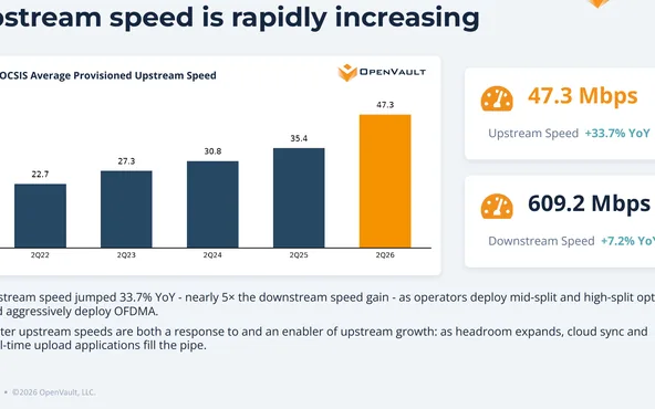
The only recurring source here for how much data households actually use, as opposed to what they can buy: average and median consumption per subscriber, upstream growth and the share of power users, measured across millions of subscriber lines. Published every quarter since 2019, with the full archive on one page. Each edition requires a free signup.
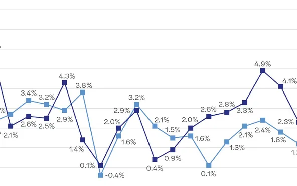
Annual operating and financial benchmarks from approximately 80 US telecom companies, a near-even mix of cooperatives and privately held businesses: ARPU, churn, margins, compensation and staffing, charted year by year. Free to read in full with no form. Each edition is an independent sample rather than a fixed panel, so the trend lines show direction, not the same companies over time.
Benchmarks 141 rural telecom companies on FY2024 results, split by regulatory regime: 102 on ACAM or Enhanced ACAM model support against 39 on legacy rate-of-return. The sample skews small, 73% with 25 or fewer employees, so it measures small ILECs rather than competitive fiber builds. Carries no ARPU or capex figures. Behind a signup form.
Adoption, affordability and pricing
What do people pay, and who actually signs up? Federal adoption series, survey data and collected plan pricing.
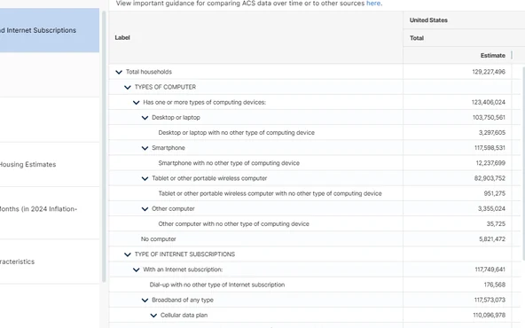
Table S2801 reports subscription type and computer ownership by household down to census tract in the 5-year estimates, with an income crosstab built in. The ACS category broadband of any type includes cellular data plans and satellite, so for wireline adoption use the cable, fiber optic or DSL line instead.
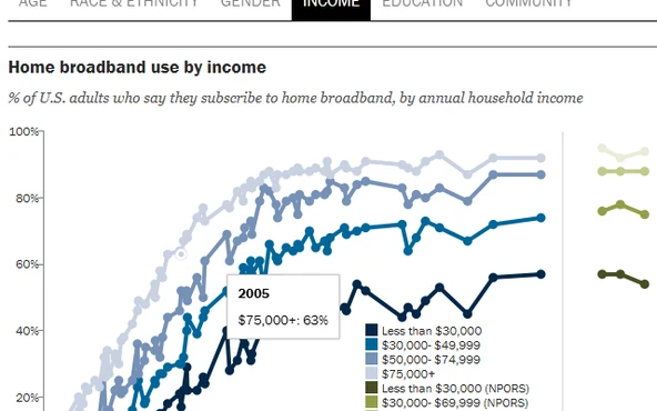
Home broadband adoption by demographic group back to 2000, from Pew's annual NPORS survey, with tabbed breakdowns and a CSV under each table. The companion mobile sheet tracks smartphone-only adults, who own a smartphone but buy no home broadband. Self-reported, and it counts adults rather than households, so there is no speed, price or provider in it.
Re-audits the standalone rate card of every active US provider quarterly, 2,800+ of them, and publishes state-level average monthly cost plus price trends by technology back to 2015. Also audits where the FCC map overstates availability. It sells ISP referrals, so check the method note on each study, and its availability figures are its own model, not the FCC's.
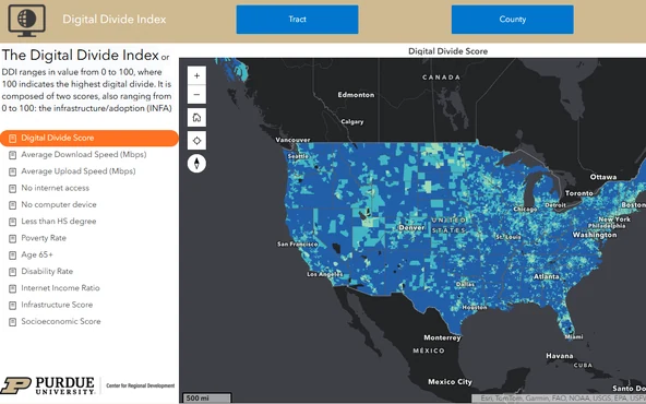
The Digital Divide Index scores census tracts and counties 0 to 100 on two components, infrastructure and adoption from Ookla Speedtest open data plus ACS, and socioeconomic factors including an internet income ratio. Scores are normalized within a tier, so tract, county and state values are not comparable. Price and usage are excluded.
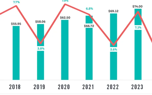
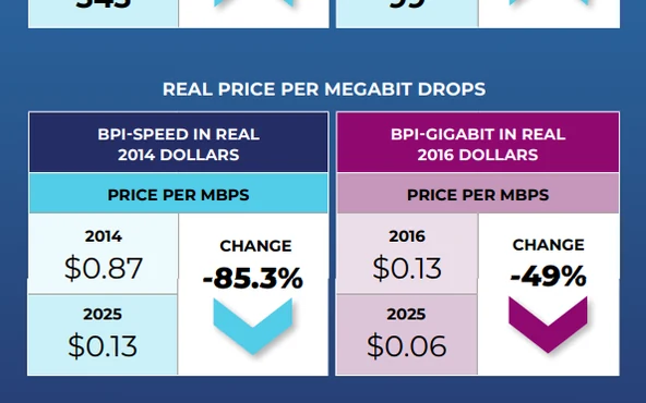
Two annual series from the wireline trade association. The Broadband Pricing Index tracks US residential wireline list prices from the FCC Urban Rate Survey across the 14 largest providers, and is speed-adjusted: each provider's 2014 plan against its nearest current equivalent, so declines are per tier, not per plan. The capex report totals industry investment, excluding cooperatives, satellite and smaller providers.
How fast is service really? Advertised speed and delivered speed are different numbers, and these 3 measure the second one differently enough that they do not agree.
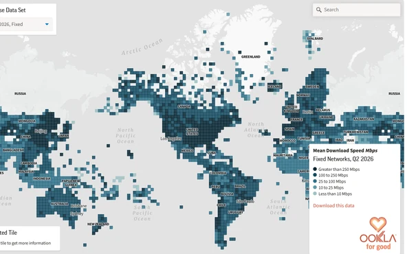
Quarterly open data with average download, upload and latency mapped to small tiles rather than country totals, back to Q1 2019. The open data license bars commercial use. The Speedtest Global Index ranks countries monthly on a rolling 3 month median. Tests are consumer-initiated, so they include the home Wi-Fi.
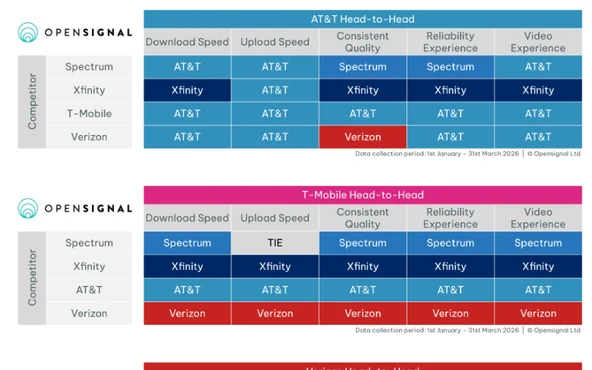
Per-country benchmark reports, free to read with no login. The US fixed broadband edition scores five ISPs on Consistent Quality, Reliability, Video and speed, then runs head-to-head comparisons weighted by how far each pair's service areas overlap. Scores are technology-agnostic, blending cable, DSL, FWA and fiber. Measurement is a consented panel rather than consumer-initiated tests.
Every test run on M-Lab's platform since 2009, published one row per test rather than as a report, and released with no restriction on commercial use. A Google account may be required for some datasets. Figures run lower than consumer speed tests and are not interchangeable.
Outages and internet health
Is the network down right now? Live outage data from 4 different vantage points, plus 2 views of the structural health underneath it.
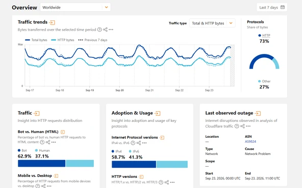
The outage table names a cause for each event, cable cut, power outage or technical problem, with the network, scope and start and end times, and exports to CSV. Events skew to national and regional disruptions outside the US, and the downloads are for non-commercial use only.
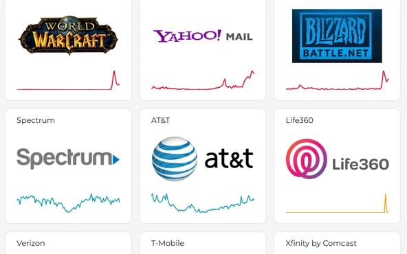
Counts user-submitted problem reports against a baseline of typical volume for that service and time of day over the previous 6 months, refreshing status every 4 minutes across 72 countries. It measures complaints, not network telemetry, so a spike can reflect an application failing rather than the ISP carrying it.
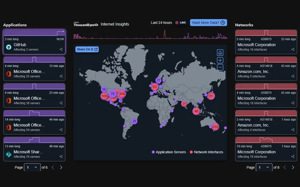
Outages are detected by active probing from the ThousandEyes agent network, not user reports, and split into network outages attributed to an ASN and application outages attributed to servers. The free map is fixed to the last 24 hours. In-depth analyses are published per incident rather than on a schedule.
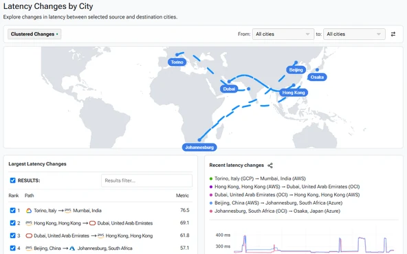
Ping-based latency measured every 30 minutes between more than 100 cloud regions across AWS, Azure, Google Cloud, Alibaba, IBM and OCI, with 7 day time series by city, geography and provider. Free, no account.
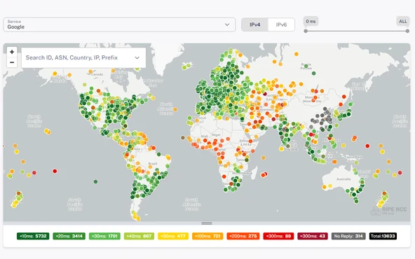
A global network of probes and anchors run by the RIPE NCC, actively measuring reachability, latency and routing rather than consumer speed. The maps plot round trip time to well-known destinations and which root name server each probe reaches. Public probe and measurement data and the REST API need no account; running your own measurements needs credits, earned by hosting a probe.
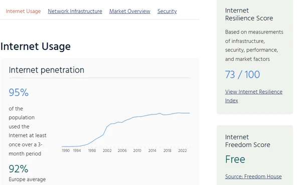
Each country report compiles an internet resilience score out of 100 alongside ISP market share, active networks, exchange point and data center counts, and adoption of IPv6 and of routing and DNS security. The separate Concentration section measures the CDN, DNS, hosting and certificate markets, not broadband. Pulse aggregates partner data rather than measuring directly.
How does the US compare? Regulators and multilaterals that publish the same measures for other countries, which is what makes comparison possible at all.
freeWorld Broadband Association · recurring report
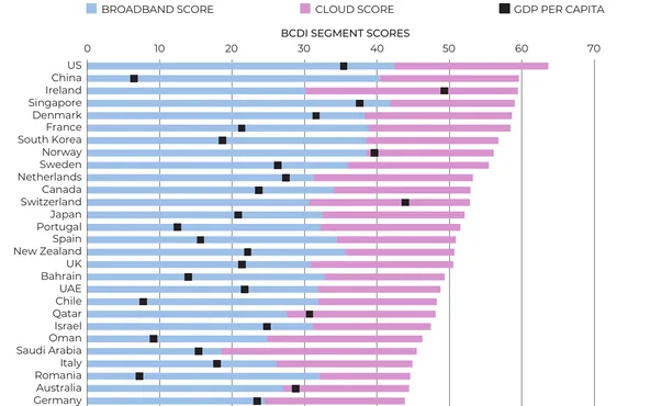
An annual index scoring fixed broadband and cloud performance across 73 countries, together covering over 95% of global GDP, each ranked against its own prior year. The 2025 edition is free to download but unlisted, since the site links only its member hub; the rest of the white paper library opens to member organizations, which currently join at no charge.
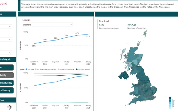
Ofcom's annual report on UK fixed availability and mobile coverage, with 2 updates during the year. Separate data downloads for fixed coverage, fixed performance and mobile, plus a methodology annex. Coverage files report maximum available speed; measured speeds on active connections come only with the annual report.
freeOrganisation for Economic Co-operation and Development · data download
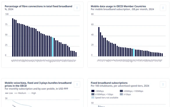
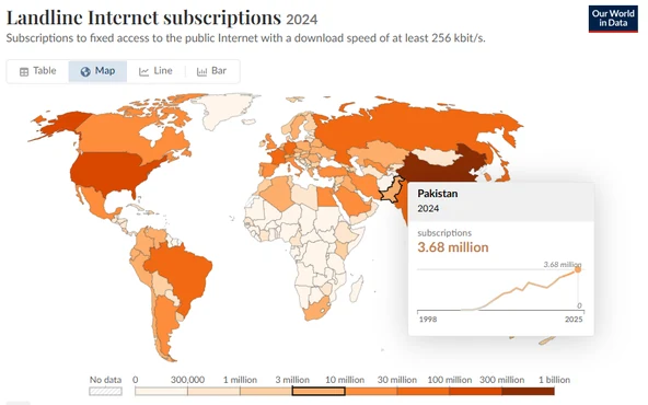
Fixed and mobile subscriptions per 100 inhabitants, technology and speed shares, price baskets and usage across OECD members plus partner economies. Also carries a directory of national broadband maps for 33 countries. Figures are subscriptions, not coverage, and speed tiers are advertised, so mobile penetration exceeds 100 and M2M SIMs are counted separately.
freeInternational Telecommunication Union · data download
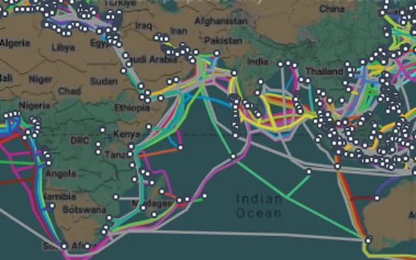
ITU's global country indicators for internet use, fixed and mobile subscriptions and price baskets, plus the annual Facts and Figures report. The paid World Telecommunication/ICT Indicators Database was discontinued in 2024 and its data is now free here. The separate infrastructure map adds fiber, microwave and submarine routes; anonymous users are capped at region-level zoom.
freeCanadian Radio-television and Telecommunications Commission · recurring report
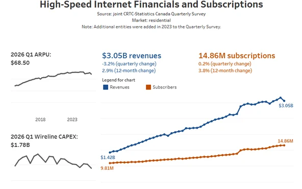
The CRTC's annual report on Canada's telecom market: prices at 3 named speed tiers, spending by income quintile, plus coverage, ARPU, churn and wireline EBITDA margins. Free in HTML with the data linked under each figure. Commission survey data trails the edition year by about 2 years.
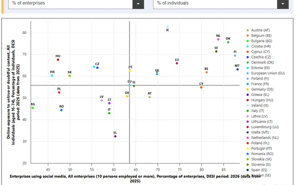
Live EU dashboard tracking member states against the binding Digital Decade 2030 targets, with dedicated groups for broadband take-up and coverage, broadband speeds and prices, and the telecom and mobile markets alongside the DESI dimensions. Covers 36 countries including the UK, Norway and Switzerland. The annual State of the Digital Decade report is the written companion.
partly paidFibre Council Europe · recurring report
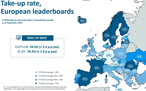
The annual European fiber benchmark from the Fibre Council Europe trade association, produced by IDATE: homes passed, household coverage and take-up across 39 countries, with a separate country-level report. Metrics are FTTH/B homes passed and fiber take-up, not broadband penetration. A login is required, non-members purchase PDFs, and per-country detail is members only.
Global infrastructure and curated lists
What sits underneath all of it? The physical backbone, a chart layer over the global indicators, and where to look when a question falls outside this list.
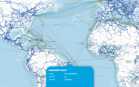
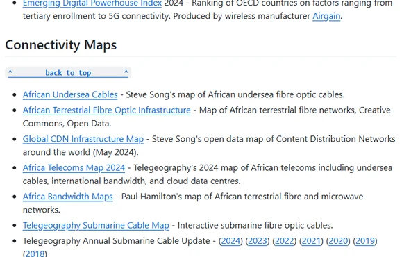
Ready-for-service date, length in kilometers, owners, suppliers and landing points for every cable system TeleGeography tracks, which it puts at more than 600 active and planned. Routes are stylized rather than surveyed. Sponsor-funded and free; capacity and fault data sit in its paid research service. Backbone and subsea, not last mile.
ITU indicators redistributed through the World Bank, charted with the source cited and a CSV that needs no account, refreshed twice a year on the World Development Indicators cycle. Mind the ceiling: the highest speed tier ITU reports is 10 Mbit/s and over, so nothing here separates a DSL line from gigabit fiber.
An index of other people's sources rather than a dataset: connectivity indexes, maps and recurring reports, with back editions kept, which is how you build a time series from reports that only publish the current one. Global and development-focused rather than US. Updated in bursts a few times a year, and some links have gone dead.
Looking for a specific state?
State and territory broadband and BEAD maps are indexed separately, one entry per jurisdiction, with what each map shows.