
Why Your Metrics Should Roll Up to the Serving Area
At Metro Connect this year we spent most of our conversations asking operators where reporting hurts. The companies varied in size and the vocabulary varied with them, but nearly every answer landed on the same unit, whether they called it the serving area or the FSA. One CTO described the ops reports his team sends up to the portfolio: passings by market, churn, ARPU and cost per passing, all of it grouped geographically.
What Is a Fiber Serving Area?
A fiber serving area, or FSA, is the group of homes that one piece of network equipment can reach, and it goes live all at once. Operators also call it a distribution area, a fiberhood, or simply a zone. Same object, different vocabulary.
The boundary does not start with engineering, and it does not start with marketing either. A planning team runs the assessment and produces a high level design, weighing demographics, how hard an area is to build, and how much competition is already sitting there. That gets refined against the high level network design and against the things nobody can move: waterways, bridges, municipal boundaries. Engineering then finalizes it in the low level design, where the cable pathway and the splitter math decide exactly where the line falls.
So marketing does not draw the shape, though the commercial case helped put it there. And once it exists, everyone downstream inherits it. With centralized split GPON, the day a cabinet is turned up is the day every home behind it becomes serviceable, which makes it the day marketing can sell into it, the day installs can be scheduled, and the day the capital in that cabinet finally has a denominator.
What to Track at the Zone Level
Once the shape exists it becomes the natural place to hang everything else. Build milestones and homes passed for construction. Scheduled installs, penetration and churn for sales. ARPU and cost per home passed for finance. All of it is more useful at the zone than at the market or the state, because a zone is small enough that the number describes something you can actually go do something about.
How Do You Compare Zones That Went Live in Different Months?
Once every zone carries a light date you can group by it, and the more useful move is to stop comparing calendar months altogether. A zone lit in April and one lit in September will never look alike on a calendar chart, because one has had five more months to sell. Lined up by months from light, they finally do.
So in November we do not care much about November. We care whether the zones that are six months past light hit the number, which is the difference between “penetration is 22 percent” and “penetration is 22 percent against a 27 percent goal at month six.”
Do You Need a Map for This?
No, and it is worth saying plainly. A rollup where every row is a zone is still granular, still comparable, and still works in a spreadsheet in front of a lender. The grain is doing the work, not the picture.
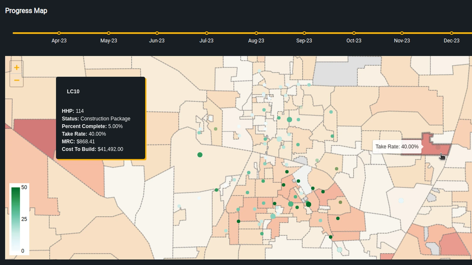
We happen to love maps anyway, and there are two jobs where the picture earns its place. A marketing team can pull up the map, find the lit zones with low take rate, and put a campaign or a promotion exactly there. A network team chasing a problem can see whether complaints cluster inside one cabinet’s footprint or scatter across three, which is the difference between one truck roll and an afternoon of guessing.
How We Approach Serving Area Reporting
At BBI our zone aggregator joins survey data, billing data and construction tracking into a single wide row per zone, which can run to hundreds of columns, so take rate, ARPU, cost per home passed and homes per mile all sit at the same grain. A cohort calculator then walks every lit zone and stamps its penetration by months from activation, so month six is a column rather than a spreadsheet exercise.
Our map colors those same polygons by whichever metric you choose, percent complete, take rate, cost per home passed, homes per mile, and a slider moves it forward month by month. That last part only works because we snapshot the underlying data daily, so there is a history to move through. You get space and time in one view.
If your reporting still rolls up to the market or the state and you have never looked at it by serving area, that is the first place we would point you. Reach out to us!