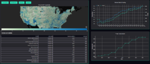
With the ACP enrollment closed and the funding expected to run out in April, we wanted to release a map to help show the impact if this program ends. Our map features interactive graphs which show the amount of funding and ACP participants per county, along with the ISP provider availability and FCC home growth stats.
We encourage you to view the map and don’t forget to continue to be vocal and advocate for an extension of ACP funding. The map is available here:
ACP Analysis
With the ACP enrollment closed and the funding expected to run out in April, we wanted to release a map to show the impact if this program ends

