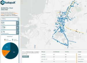
This month we finished a sample map and dashboard in collaboration with Katapult Engineering, it’s available for anyone:
Katapult Pro – Dashboard Sample
We used Katapult Pro municipal audit data to create an interactive dashboard that highlights areas for broadband deployment. Local leaders and municipalities can use maps like this to inform and conduct feasibility studies and encourage providers to build in their area.
Katapult has amazing tools, processes, and software which helps you collect and review high-quality, detailed data for utility poles and make ready engineering. While your team can see the inherent value in a raw dataset, visualizing information through dashboards, analytics, and reports can be a powerful resource for decision-makers and clients.
Whether you’re trying to track your projects, pinpoint areas for improvement, or dig deeper into your team’s capabilities, how you analyze and present info can help your team leverage data to its full potential.
If you’re looking for ways to get more out of your data, shoot us a message!

